At first glance, Insa's work may just appear to be misogynistic. Much of it is packed with graphic depictions of female body parts (I bet you can guess which ones) conveniently placed in suggestive positions.


See what I mean? But there's more to Insa's art than female objectification. Don't get me wrong -- that's certainly a large component to his work, but it's not as offensive as it seems. This guy is a self-proclaimed woman-lover with an affinity for shoes. And not just any shoes. INSA designs custom high heels.
When he's not making shoes, INSA makes large scale works (often covering a wall or stretching across a whole room) mostly out of spray paint. The pieces focus on the idea of commodification of the female body as a sexualized utensil used to sell products. And I think we can all agree that this tactic is all over the place. It's simple: sex sells. Insa knows it just like we all know it.
 That said, his work has been met with much criticism. While it's common and, dare I say, acceptable for the female figure to be casually thrown around in the material world, it is disrespectful in other contexts. Especially in art. Classically speaking, sexy, naked women are not sexy and naked, they are refined and nude. Insa's work points out this double standard while acting as a commentary on how in the individual has been removed from female sexuality in the context of popular consumer culture.
During an interview with Sneaker Freaker Magazine, Insa said, "When the image isn’t selling you something, it’s more sho cking. We actually notice the sexuality and not the product being sold to us. Like we have been programmed to accept this form of consumer sexuality as a different thing to the sexuality in our real lives."
Insa's work also points out the sheer fetishism in consumerism. He admittedly buys into the trends (C'mon, the guy designs ladies' shoes), but he presents them in a way that empowers women. Not only are Insa's pieces sexually liberating, but they point out the foolishness of modern stereotypes used by men to discuss women. Like that debate between girls that wear sneakers (who are not restricted by their gender) versus girls that wear heals (who understand the power of their sexuality): which do men prefer? Who cares. Insa uses them both but reduces them to mere gestures. At the center of any shoe in any style is a single, fleshy foot. The foot is where its at.

See? THERE.photo credit:
top left: Insa, Exterior Gloss in Purple, Glasgow, 2007, courtesy of the artist's website
top right: Insa, Title unknown, taken from an installation in Lisbon, 2009, courtesy of Juxtapoz Magazine
bottom right: advertisement for Lynx Shower Gel, Wash Me, 2007
bottom left: Insa, Inner/Outer, Spray paint and marker on canvas, 5' x 2,' 2008, courtesy of the artist's website
bottom: foot anatomy, taken from active.com
 It's time to ask another age-old question.
What could be better than...
A
GIANT
PIECE
OF
CAKE
? !
Probably nothing. But that's what Claes Oldenburg is all about -- creating works of ultimate indulgence. Like other pop art, Oldenberg's work (in conjunction with his calloborations with wife and sculptor Coosje van Bruggen), is based around the idea of decontextualizing easily recognized objects with strong associations.
Unlike some other pop artists, Oldenburg is famous for making giant sculptures of basic, everyday items, not just specific consumer-obsessed brand products (take Warhol's Campbell's Soup Cans, for instance). In a way, his pieces are more ridiculous than that of some other pop artists. The pieces are not terribly realistic looking so much as strange and banally simplified.
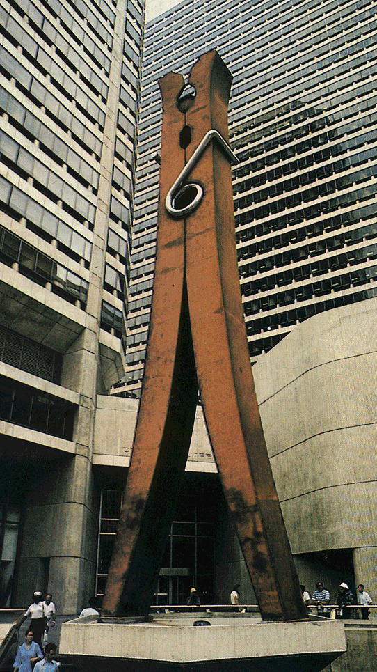
There is definite humor to Oldenburg's work. Though brand-free, each of the objects he recreates are ones with close human and cultural associations. He takes the most seemingly ordinary objects and foods and makes them huge. Take his 45ft tall clothespin. While clothespins are generally regarded as mundane and harmless, Oldenburg presents it as a huge somewhat daunting beacon. The clothespin is a mighty hero towering over Philadelphia. That's funny, right?
Oldenburg's materials are pretty strange as well. He made a number of so-called "soft sculptures" that are pretty much what their names imply; instead of being made out of hard, solid materials like the clothespin, many of Oldenburg's pieces are made primarily from soft vinyls. This contributes a certain fleshy feel to the pieces, not to mention certain sexual overtones. In that way, he strips objects of their normal implications and inserts others that we (ideally) only apply to other people.
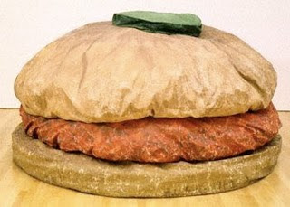
So what does it mean to have a huge (perhaps sexual), grimy hamburger that resembles something of an old crumpled happy meal? I don't know, but I want to eat it.
photo credit:
top left: Claes Oldenburg, Floor Cake, mixed media, 60" x 9" x 48," 1962
top right: Claes Oldenburg, Clothespin, cor-ten and stainless steel, 1962
center: Claus Oldenburg, Floor Burger, canvas, foam, rubber, 52" x 84," 1962
If I took 4 tabs of acid,
 I would hope to end up in front of a Fred Tomaselli piece.
Fred Tomaselli's paintings collage prescription pills, hallucinogenic plants, herbs, and leaves with repeated images of bugs, butterflies, flower, and various segmented body parts. These separate bits are then placed in swirling patterns spread over the huge wood surfaces. Once collaged, the pieces are covered in a thick layer of clear epoxy resin.
 There are common themes in Tomaselli's work. Most of his pieces portray one or more of the following four images: birds, human bodies, trees/flowers, and one of two types of designs -- one resembles loopy tangles of colorful noodles and the other something you might make using Spirograph. But the way that Tomaselli illustrates these subjects is, to be blunt, strange. Each of his pieces are at once provocative, graphic, and, in my opinion, just plain pretty.
What I love most about Tomaselli's work is the attention and seriousness it demands. Whether struck by his use of a melting face with 15+ eyes, colorful psychedelic paisley, or the elaborate muscle tissue created i nside of his figures, it's hard to not endlessly stare at these paintings. And they are rather dark, too. While the Tomaselli's patterns are no doubt beautiful and intricate, they appear to virtually infest the pieces and their residing characters. There is a sense of uncontrollable viral diffusion, reflected particularly by the vibrant medley of drugs in each work. The characters are alone in dark expanses, falling, looking out, lost in their environments of diseased chaos. Tomaselli said, "I want people to get lost in the work. I want to seduce people into it and I want people to escape inside the world of the work" (artinfo).
I'm there.photo credit:
top: Fred Tomaselli, Hang Over, 2005, leaves, pills, acrylic and resin on wood panel, 84 x 120 inches, Courtesy James Cohan Gallery
left: Fred Tomaselli, Organism, (2005). Mixed media, photo-collage, acrylic, gouache, resin on wood panel painting, 99 x 77 inches
right: Fred Tomaselli, Big Bird, 2004, Mixed media and resin on wood panel, 48 x 48 in, Courtesy White Cube
"Photography is about freezing a moment in time; McGinley's is about freezing a stage in a lifetime. Young and beautiful is as fleeting as a camera snap--and thus all the more worth preserving." - Jeffrey Kluger, TIME
 There are lots of reasons to admire Ryan McGinley. For starters, his life appears to be extremely glamorous. He is always surrounded by gorgeous, naked people. He runs, skips, and jumps through open fields, cliffs over water, and atop abandoned buildings. And he was best friends with Dash Snow. And he explores caves. And he still uses film. Oh, and did I mention he's young and talented? McGinley had a solo show at the Whitney at the age of 25.
McGinley is an interesting man to look up to. He's the type of guy who your parents probably don't want you hanging out with, but you think he's the coolest anyway.
For the most part, McGinely takes photographs based on his real-life experiences and friends. In doing so, he captures a glorious pocket of young, New York subculture, drug-infused, active, hazy, raw, and impossibly beautiful. Virtually all of his photographs are centered around one or more charismatic nude subjects posing in a provocative but seemingly real way. Though many of the works appear to be rat her candid, McGinley's subjects are indeed posing. Very aware of the camera and all of its implications, the subjects openly interact with the photographer, exhibiting their bodies, tattoos, scars, ugliest and prettiest faces in pretty bizarre (but gorgeous) of places. Both McGinley and his subjects are upfront in the pictures. He shows it how it is: people are sexual; they do drugs; they write graffiti; some of them are gay.
And he's not just documenting these things. Unlike some other photographers whose work is purely voyeuristic and/or of a photojournalistic nature, McGinley is living (and loving) this lifestyle. This is what makes him so appealing: his photos are of the sincerest nature, giving a true vision into his subculture, social functioning, and spontaneity.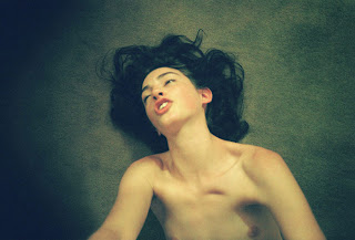
McGinley is certainly not the first to do this. His works clearly reference Nan Goldin, who began to take photographs of a similar nature 3o years earlier. The major difference in the two artists' work is that while Goldin's photographs are marked with extreme sadness and guilt, McGinley's photographs are triumphant and celebratory. He takes situations and people that may not conventionally be considered attractive, and makes them utterly irresistible and perfectly enchanting.
In a sense, McGinley is paying homage to the gods of alternative culture. Active youth is eternal beauty. The photos speak to me in the most happy-go-lucky hazy soft of way. "Be young! Be free! Be true! Make silly decisions and look great while doing it! It will be alright. It will be beautiful."photo credit:
top center: Jonas (Shining Soft), 2008 / 2009
top right: Kiss Explosion, 2005
left: Jake, Ocean. 2005
bottom right: Laura, 2007
all courtesy of the artist's website
In 2004, Andrew Hung and Benjamin John Power formed Fuck Buttons with the goal of creating pain-inducing noise music. They soon, however, became interested in combining pretty sounds with the harsher ones, adding more structure and melody to their songs. Hung and Power combine a number of makeshift synthesizers (remember the Fisher Price karaoke machine?), casiotone keyboards, mixers, hand held instruments, and distorted microphones to create their music. The result is something between gorgeous and terrifying.
Timing is of utmost importance for Fuck Buttons. Unlike some other noise groups, they're not afraid to let a beat drone on forever or to play a pedal loop for 10 minutes straight. While more traditional sound artists (let's take "traditional" with a grain of salt here) may worry about loops going for too long, Fuck Buttons intentionally drones on forever. The duo is clearly interested in what happens when they just let sounds ride out indefinitely, allowing their songs to go on just past an expected point before reaching a sudden switch. The music thus constantly builds upon itself while adding a considerable amount of tension for the listeners.This is what I love most about Fuck Buttons: they are constantly messing with their listeners. The music incorporates complete predictability in its loops but forces listeners to be patient and expect an abstract unexpected. Listeners are pulled in and hooked through the entrancing rhythms and made intentionally uncomfortable at the same time. This creates an interesting relationship between musician and listener, one that almost could be compared to that of master/slave. Overall, the band reclaims what is sound, what is beautiful, what is pain, and what is pleasure.
Above is a video of Fuck Buttons performing their song Ribs Out from their first full length album, Street Horrrsing.
Photo/video credit:
top photo: taken from Stereo Jealousy
top video: Fuck Buttons, Surf Solar, 2009 courtesy of youtube
bottom video: Fuck Buttons performing Ribs Out, April 7, 2008 at the Club Downunder in Tallahassee, FL, courtesy of youtube.
Rubik's Cubes will always hold a very special place in my heart, somewhere between the spots reserved for Pogs and Mr. Bucket ("The first to get their balls in Mr. Bucket wins!").
 I remember the first time I solved my own cube. I was 12 years old, not very coordinated, and believed that the toy truly measured my own intelligence. After three months of hard work, I sleighed the beast that is Rubik's. This started me off down a slippery slope of obsessive puzzle solving. The regular 3x3 Rubik's Cube was not enough; I needed more; a real challenge. (I was, like, so intelligent.) Hello, 4x4, gordian knot, snake cube, Gameboy tetris.
This went on for a while. Needless to say, I gained a strong appreciation for bright colors and pixelated patterns. That's probably why I'm so drawn to the giant images made by Cube Works Studio.
 The artists at Cube Works make giant pixelated representations of famous images using nothing but Rubik's Cubes. These famous pictures include Da Vinci's The Last Supper, Michelangelo's Creation of Man, and portraits of superstars like Marilyn Monroe and George Harrison. The pieces are large in scale and weight, and you can imagine why: The Creation of Man required an astonishing 250,798 cubes. The Cube Works Studio is certainly not the first group to use Rubik's Cubes for art (it's been noted as its own sub-genre of folk art), but this team of assemblers takes the method to a new extreme via scale.
The idea is to reinvent works that are easily recognized and relevant to the public. The combination of such imagery with the o nce-beloved toy acts as both a source of nostalgia and comic relief. Let us make light of Jesus's last meal, shall we?
I admire the way that the guys at Cube Works combine consumerism into their art. Rubik's Cubes are a perfect object to use to comment on the relationship between materialism and pop culture. They are utterly useless and worthless in any physical or practical sense, but they are still the cat's meow. According to Wikipedia, within 7 years of the toy's worldwide release, sales surpassed thirty million units, becoming "the world's most asked-for plaything." Using such hyper-iconic images with hyper-monumental toys yields hyper-awesome results, more appealing, applicable, and, dare I say, smile inducing than ever before.
And it's always nice to see something nice come out of our recycled toys. Sure beats this guy:

Photo Credit:
top: Ryan Kinnen
Right: making The Creation of Man, Cube Works Studio, taken from Loyal K.N.G.
Left: Cube Works Studio, Barcroft Media, taken from zimbio
Bottom: Rubik's Cube in popular culture
Okay. Have you ever wanting to paint the edges of an Alexander Calder mobile and then spin it around at, say, 20 mph just to see the design it makes? Me too.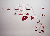

---->
Fantasize no more; this pipe dream, I imagine, has been made real by Julie Mehretu.
Mehretu makes large-scale abstract paintings that are just oozing with movement. The paintings' strength are in their layering: each work has a thick build up of layers of acrylic, pencil, pen, and ink. The works speak to architecture and city life, specifically referenc ing the congestion
 and noise associated with the latter. She uses the general set ups of real gridded cities and overlays them in such a way that creates new abstract cities; in this process, the constant movement of the city is slowed and flattened, its many dimensions reduced to a single, visible map.
The clear sense of motion in Mehretu's work clearly elicit that of both the abstract expressionists before her and similar performance artists who make time-based art. The paintings act as a simplified compression of time while serving as documentation of her own time and movements. Two narratives are thus created through the pieces, one telling a story of flux and evanescence in a bigger, empty space and a second chronicling Mehretu's singular movements into a permanent fixture. In a sense, this makes the paintings incredibly personal.
Notions of intimacy come u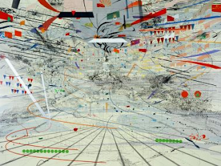 p over and over in the work, perhaps due to the nature of the artist's subject matters. In these landscapes, Mehretu creates busy cities, which are already notorious for being cold and impersonal, and puts her viewers right in the midst of their chaos. The imagery could be described as reductive and even confusing, representing specific places and people as dots or triangles or lines. In this way, the city is made more impersonal and abstract. But there is warmth to the pieces as well. Everything feels terribly in place, even the areas where the ink smudges, and it's easy to accept one's place amongst the chaos.
Plus, I like all the little explanations I can make for the different parts. See that one red dot? That's me. And you're the line of green dots on the right -- it's not that you're fat; you're just moving a lot. Cheers.photo credit:
Top left: Alexander Calder, Sumac II, 1952, Collection of the Sheldon Memorial Art Gallery, University of Nebraska-Lincoln
Middle right: Julie Mehretu, Stadia I, 2003, ink and acrylic on canvas, 108" x 144" Bottom left: Julie Mehretu, Congress, 2003, ink and acrylic on canvas, 72" x 96"
 Mark Dean Veca loves intestines.
Amongst other things, he makes giant paintings and large-scale installations often painted directly onto the wall. These paintings are filled with organic, grotesque, lumpy forms and intricate interlocking patterns, eliciting clear references to organs, carnality, and the ov erall form of the internal body. Veca is known for creating cartoons, psychedelic landscapes, and iconographic imagery while incorporating long-established (and sometimes sickening) decorative motifs.
The works are extremely illustrative, which makes them a little funny. Veca attempts to create two dimensional representations of internal and external bodily figures and tensions as he experiences them, resulting in bright, towering, writhing structures. The pieces are neurotic, repetitive, and obsessive, amplified by their complexity and scale. (Even his small works are incredibly intricate and packed with detail.) Woven into the visceral bits are popular and/or historical iconic figures. So he makes work about the body, its functioning as a gross unit, and its similarities with pop culture.
I think I could hang with MDV. It seems that we're compatibly neurotic and fascinated with the same obsessive imagery and processes. Most of my work focuses on similar themes and generally incorporates repetitive, taxing tasks resembling Veca's.
It's too bad LNS doesn't look anything like MTV. Or anything cool. Except this:

Thanks, LANLord Networking Systems. Double angel status!photo credit:
top: "Phantasmagoria," Mark Dean Veca, site specific installation, 2008
right: Mark Dean Veca's Retrospective at the University Art Gallery at UCSD, 2009
left: Mark Dean Veca logo, 2009, acrylic on tyvek
bottom: LANLord Networking Systems Inc.
"The music sounds like helicopters taking off in a kitchen on Mars, where the plants on the windowsill have dog heads and howl for a midday water drip, and the toaster spits cookies from its mouth at will. Beautiful and bizarre, narcotizing, sending visitors to a little place inside their heads generally reserved for hallucinatory effects and self-realization."
- losanjealous.com Gang Gang Dance encompass music, noise, dance, performance art, theater, DJing, film, and visual art into one curious, visceral amalgam. They're a band who is just as likely to play in a museum or gallery as they are a nightclub (such as Rochester's Bug Jar in August of '09). The key is their unique style of music, incorporating beats and melodies from every continent played through a series of synthesizers and computers, looped into entrancing, intricately layered rhythms. On top, several drums and guitars are played and vocalist Lizzi Bougatsos echoes (sings, chants, screams, howls, whatever you'd like) her dreamy poetry:
Prisms have kissed my lids //// Sea salt has rubbed on my hips
In 2007, the band released a 30 minute sound and video collaboration titled Rettina Riddim, which documented their history and career. The film pieces live recordings, field recordings, and practice tapes alongside shots of friends, fans, and found footage, creating a work that is smooth and mystic while building into a "pleasant state of sensory overload" (Georg Gatsas, via Whitney Museum of American Art). Above all, the film is raw and demanding, stressing the band's main (and apparent) position on music: it is both its own form of art and an integral part of other mediums.
In 2008, Gang Gang Dance played at the Whitney Museum's Biennial as part of a performance/installation piece. The band built a wall of mirrors facing the audience, behind which they filmed themselves playing. The film was then projected as a live feed onto the mirror wall but did not immediately show up (because that's what happens when one projects onto mirrors). Band members dressed up in elaborate masks and costumes drawn from the eclectic cultures that their music references. Throughout the set, one band member painted white paint along the mirror so that the feed slowly began to show, literally painting the band into sight. You can watch some of the Whitney performance and the band's thoughts about the piece below.
photo & video credit:
quote and photo courtesy losanjealous.com, http://www.losanjealous.com/2009/02/09/gang-gang-dance-and-ariel-pinks-haunted-graffiti-the-smell-february-2-2009/
Live performance video courtesy of youtube, taken from http://www.youtube.com/watch?v=sam1Ybm-cRE
Whitney video courtesy of artreview.com, taken from http://www.youtube.com/watch?v=1dJd55sJgWg&feature=related
Tattoos are interesting. They've certainly come a long way in terms of social acceptance, significance, reputation, etc.
I think that the option of choosing clothing and one's look is both amazing and fascinating. It allows individuals to use their bodies as canvases every day. We are all given this clean, soft, fleshy material with which we can do virtually what ever we want. (Let's ignore im plications of social control and stigmas for a moment.) Wanna wear blue eyeshadow? Do it. Wanna wear a tutu? Sure. Sparkly shoes? 10 clashing patterns? A chicken suit? Go ahead. Clothes rock! I digress.
Tattooing takes this idea one step further, adding permanent elements to the body. Entrusting somebody to make a permanent design on your body takes a lot of trust. Even when planned out well, the artist is given a huge degree of free range and control over the tattoo. Given the right canvas, the artist can create any eternal painting. That's why I like Amanda Wachob.
Wachob is both a painter and a tattoo artist, a background that clearly influences her works. She doesn't follow the typical flash art tattoo motif; there will be no tigers popping out of a skull's eye underneath a bleeding heart impaled by diamonds. Instead, she makes abstract tattoos that resemble individual brush strokes.
As a painter, I'm used to having strokes of paint on my body, but they always make me feel like I need a good shower. Traces of paint on my arms and legs seem anything but permanent, more a testament to my own artistry and laziness. Still, I love the idea of letting an artist design her own work and let her make an honest mark -- not a picture -- on the body. It challenges the conventional norms associated with the body as an image and as a living entity.
afterword by tupac:
I been handlin' stress in this shit for years
blazed out sheddin' tattooed tears
photo credit:
top: "bad tattoos," http://popnewsday.wordpress.com/
both Wachob photos courtesy of the artist's website
bottom: tatu, http://vu.morrissey-solo.com/sleeper/stretch/log.htm
FPRYEFX .... that's what she said?
Each of Bratsa Bonifacho's paintings is composed in a very similar and specific way: every individual work is split up into a grid of equally portioned boxes, filled with different colored symbols (either letters, numbers, or pictures). They are large in scale, alarmingly colorf ul, and a little overwhelming.
I was initially interested in Bonifacho's work because it seems to reference a number of Jasper John's paintings (via Numbers In Color, for example). I'm attracted to both artists' paintings for similar reasons, but they represent different things to me. Both artists use arbitrary but iconic symbols (numbers, letters, simple silhouettes) to celebrate color and form while demanding specific reactions and associations: that is, it is impossible to look at works like Bonifacho's Decoder What!! and not recognize the letters and punctuation marks as part of our own coveted language.
In his latest series Human Farm, Bonifacho takes these ideas a step further, this time specifically focusing on the scripting of computer viruses. In these pieces, he imitates the effects of said viruses by scrambling the letters int he pictures in the paintings, allowing them to flow out of their clean boxes and distort one another. (Hello Jasper Johns 2.0.) This is indicative of the many layers of confusion and chaos that result from such sicknesses. The swirlin g forms begin to make their own organic forms, precarious and destructive.
To me, the paintings signify something well beyond the tension between elegance and resulting catastrophe of computer bugs. I understand Bonifacho's pieces as representations of the fragility of humanity, both culturally and physically. By knocking the letters of their clean-cut boxes, Bonifacho creates a violent atmosphere out of something we are so comfortable with and jaded by that it creates the ultimate benign atmosphere. (Words should be soothing, right?)
Indeed, the effects of computer viruses are easily comparable w ith that of human diseases, a topic that I explore in much of my own work. When the sickness strikes, all of the essential pieces are still there, the letters, numbers, pictures, but their infrastructure slowly begins to collapse, forming something beautiful but utterly crushing and painfully differently. The landslide of symbols create the illusion of toppling downward upon a slippery slope that they have no chance of climbing up again.
pictured above:
top: detail shot, De Viribus Quantitatus, 48" x 48," oil on canvas
top right: Decoder What!!, 48" x 48," oil on canvas
left: Tarabuste, 54" x 67," oil on canvas
bottom right: Sekretum Sekretorum, 52" x 58," oil on canvas
all courtesy of the artist's website
"I laughed and said, Life is easy. What I meant was, Life is easy with you here, and when you leave, it will be hard again."-
Miranda July, from No One Belongs Here More Than You.Miranda July is just oozing with talent. She is a performance (or is it performing?) artist, writer, actress, film director, and musician. I first fell in love with her in her 2005 movie Me and You and Everyone We Know, which she both acted in and wrote. I got another sweet taste of her in her 2007 collection of short stories No One Belongs Here More Than You, which is now one of my favorite books ever.
What I love about July's work is her ability to reach out to her audiences in a brutally honest and raw way. Her stories are written with almost childlike sincerity and thoughtfulness, making sense of certain universal (but seemingly surreal) truths, like the inevitable loneliness of the human condition. Her characters are clumsy, sad, and painfully ordinary, but sometimes they reach out to each other. The plots are bizarre but virtually disposable; the clear importance of July's work is in how characters interact and in the fact of interaction itself.This same focus comes through in the artist's websites as well, which take a particularly performative route. In turn, her sites force interaction between artist and viewer, an odd idea in that this interaction is taking place over the most public and anonymous medium of interaction. Indeed, the website for No One Belongs Here More Than You is split into a number of photographs that tell the story of the book's release tour. Oh, and each photo is of a hand-written message from the author, scrawled onto the top of her stove. The viewer must clic
 k an arrow at the bottom right corner to advance to the next page, and, in doing so, he says, "Yes, I am listening." July's messages are both funny and sweet, allowing the reader to forget the absurdity and commanding nature of the whole operation.
July's homepage opens with an equally bizarre and demanding splash page, asking readers to enter the secret admission password. "(you know the password, just clear your mind and look within. it will probably be the first word you think of.) (if this doesn't work, try looking at a candle for a few seconds.)" I remember the first time I browsed the site, immediately writing "BLANKETS" into the allotted password bar. Of course, any password works -- even not typing in a password and just hitting 'submit' -- and advances you to the main page whose header reads, "YOU OBVIOUSLY KNOW WHAT I'M TALKING ABOUT."
I believe t his idea to be the most interesting part of July's work: that is, she is always in constant conversation and communication with her audiences, but never really letting them say anything. She's always filling in the blanks, whether it be by only allowing a next arrow or by revealing that their own thought-out secret passwords are unimportant. Still, she appears to listen and engage in something sincere. "YOU OBVIOUSLY KNOW WHAT I'M TALKING ABOUT." And it is comforting and cozy there, nuzzled into Miranda July's mind.
I'm always trying to figure out what communication can possibly be real and/or sincere. More often than not, I feel a huge disconnect between my brain and mouth and hands, knowing that I cannot accurately express a single idea with more than one of those places. This seems to be what July is getting at: I imagine her saying, "I know this isn't real. I know you can't really see me. But I'm trying, and we are talking, and something is happening."
She then pauses and quotes her book,
"What a terrible mistake to let go of something wonderful for something real."
Cake.

Lots
and lots
and lots of cake.
In her series The Confections, Amy Stevens takes photographs of her own homemade cakes placed over different patterns. The works appear as obsessive studies of color and design. The images are both aesthetically pleasing and grotesque, not to mention totally bizarre.
The series began as the artist's response to turning 30. Confronted with the reality (and fear) of aging and the entailed stereotypical norms of femininity, Stevens ordered a Martha Stewart cake-making kit and attempted to follow an online instructional video. She planned on baking 30 fancy cakes for herself and then photograph them. Needless to say, her cakes were lumpy and, well, gross next to Ms. Stewart's, which opened Steven's eyes into a world of cake creativity.
The cakes reflect the artist's desire to produce objects of sincere beauty and feminine perfection while addressing the absurdity of the process. The cakes are indicative of contempor ary Western culture in which females are held to the sugar-frosted expectation of decorating, cooking, and entertaining in a chic, Martha Stewart way: that is, low-brow commonality with the slightest visible touch a woman's hand.
Stevens is interested in the role that women play in society, and I like the way in which she explores the topic. Cake is perishable, crumbly, and seems to hold much more symbolic importance than physical purpose. (This is not to say that cake is a delicious staple of my diet.) The work hints at the perhaps larger topic of human interaction, taking an ordinary food that immediately conjures implications of celebration, collective experiences, and unity but specifically speaks to the isolating and cliche nature of said events. In turn, The Confections ultimately raise questions about the authenticity of processes and (relying on) forced emotion, two topics that I explore in my own work.
I love the because they are beautiful, lonely, and painfully sad while still remaining triumphant, colorful, and celebratory. Plus, I totally want to eat all of them.
Pictured above:
top left: Confections #25, Archival inkjet printer, 2006
top right: Confections #20, Archival inkjet print, 2006
bottom right: Confections #40, Archival inkjet print, 2007
 Vik Muniz. What a man.
I love the versatility in Muniz's work. He's famous for using "unconventional" materials to create his images such as chocolate syrup, sugar, dust, wire, thread, peanut butter, candy, silly putty, etc. and then photographing them. I have dabbled around with a few of these substances, but I've never been able to render an image so crisp as Muniz.
His work is centered around the notion of reinterpretation, replicating famous images in the foreign materials abovementioned. To me, his w ork speaks specifically to the extreme materialism surrounding said symbolic pictures: they literally become sugar-coated, colorful, and seemingly simple. We are a consumptive people, and cultural icons (I am using the term "icon" liberally, defined as including anything of iconic importance at the moment - the latest fad or hot topic, positive or otherwise) are quickly transformed into franchises.
This is an idea I have also explored, specifically focusing on  how materialism softens and distorts truth. I looked speficially at the image of the American soldiers raising the American flag at Iwo Jima. The event was nothing like it became known as (something shiny beacon of American strength, patriotism, whatever), yet it's still known for it. To me, this suggests that the American history and sense of identity is false and sugar coated, represented more by its material consumer value ("hey! this is a nice picture to stir up American nationalism. it'll sell like velveeta to hillbillies. perfect.") and brought up out of consumer convenience rather than necessity. In fact, this image was marketed as a comforting image post September 11th. Why? I don't know, it looks nice on paper, I guess.
In my own reinterpretation of Iwo Jima, I recreated the famed image using nothing but Jelly Belly jelly beans.
Cheers, Vik.
Photos above:
(top) barry le va (diptych), Vik Muniz
(top left) Sigmund, Vik Muniz (both courtesy of the artist's website)
(bottom right) Iwo Jima, Lauren Schleider (photo courtesy of the artist)


 cking. We actually notice the sexuality and not the product being sold to us. Like we have been programmed to accept this form of consumer sexuality as a different thing to the sexuality in our real lives."


